What’s old is new again
Note: This was originally posted on the site on June 29th, 2013. When I migrated to a new server, this post was lost. I was able to retrieve it and, since it remains relevant I am reposting it.
They’ve been leaning in this direction for a little while, but I think it’s still worth noting that Nike has gone back to the 1980s for inspiration. Who have they been inspired by? Themselves.
Futura Extra Bold Condensed was the typeface used in the Nike logo—when there was type with the swoosh. I first remember seeing the swoosh on its own in the 1990s. That was a bold move, the first of its kind: an abstract logo symbol without any type. But then Nike’s ad campaigns were so ubiquitous, everyone knew the company behind the swoosh. But I digress. The typeface Futura was also used in their ad campaigns, created by Wieden & Kennedy, the ad agency that made them famous.

This ad is part of the famous “Bo Knows” ad campaign, the genious of Wieden & Kennedy, Nike’s ad agency.
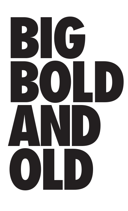
By the early 1990s, Futura Extra Bold Condensed became a typeface that simply would not die. It was used everywhere. It was used so much that some art directors even designed an ad to encourage others NOT to use it. Below is the ad.

Ad against the use of Futura
While I definitely agree Futura was overused at the time, the Nike logo looked good with it, just as it does today. The swoosh is still used on its own, but when Nike wants to go retro, it rolls out the old logo.
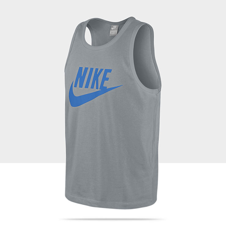
The word “Nike” returns to the Nike logo, set once again in Futura Extra Bold Condensed.
I’ve noticed that Nike has now employed Futura again on many of their ads and on many of their lines of t-shirts, including those involving the NBA and the NFL. The bold, no-nonsense geometric shapes are crisp, clear and demand our attention. In 2027, the typeface will celebrate its 100th anniversary. For an 86 year old typeface, it has aged well and lived up to its name. Just ask Nike.
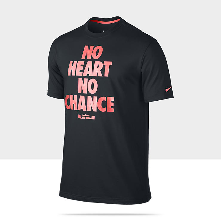
Nike T-shirt from the LeBron James line, with the type nicely set in Futura Extra Bold Condensed.
