Typographic Sins Poster
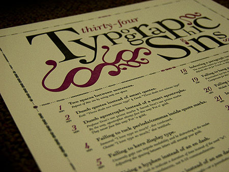
It’s been a number of years since the second edition of my Typographic Sins poster debuted. Featured on For Print Only, notcot.org, How Magazine, dozens of web sites, and pinned extensively on pinterest, I still get people who want to purchase the poster, and I still have copies left. This second edition of 200 was printed on a letterpress by Rowley Press. Here’s more about the poster.
Size: 11 inches x 17 inches
Paper: Crane Lettra 110 lb. 100% Cotton Paper in Ecru color (fancy for cream)
Colors: Black + Pantone 234 (a red with a hint of purple)
Typefaces used: Primarily Cochin LT Std, Stuyvesant ICG and ITC New Baskerville Italic.
Price: $65/each plus shipping (and tax for Utah residents)
Total Production: 200 posters. Each poster is numbered and signed by Jim Godfrey.
I accept the cards shown below. The cost of shipping is $10 for the U.S. and $40 for anywhere outside of the U.S. Please allow 4-10 days for your poster to arrive if it is shipped in the U.S. Outside the U.S. takes 3 to 4 weeks. The posters are rolled and shipped in a heavy duty cardboard tube.
Here is a little background on the poster.
Before we all started using computers to do our typesetting, there were professional typesetters who knew a lot about type and some rules for setting it appropriately. Much of this information is taught in typography courses at colleges and universities. As I taught students in my own typography class, I felt the need to have some sort of concise resource that would remind them of some of these typesetting conventions. You know, something that would lead them in typographic righteousness and keep them out of sin.
Many of the sins have been mentioned in a canon of typography books such as Robin Williams’s The Mac Is Not A Typewriter and Ellen Lupton’s Thinking with Type, Robert Bringhursts The Elements of Typographic Style. I am sure they also exist in other texts as well (like the Chicago Manual of Style, which I also consulted). It is also important to note that some of the sins are based on typesetting practices in the United States. For instance, it is more common in the UK not to tuck periods inside quotation marks (although I still think they should avoid this sin). As with all “rules” there are some sins that are worth committing under certain circumstances and others that one should never commit. For example, I hate seeing dumbquotes anywhere. Conversely, sometimes large amounts of reversed body text work aesthetically and conceptually with the design of the entire piece. True to life, we all have little sins we commit, I guess.
Here is a list of the 34 sins.
34 Typographic Sins
Two spaces between sentences.
Repent of this sin by using only one space.
Dumb quotes instead of smart quotes.
Evil: “Thou shalt not misuse type”
Good: “Thou shalt not misuse type”
Dumb apostrophe instead of a smart apostrophe.
Profane: Don’t use prime marks
Sacred: Don’t use prime marks
By the way, apostrophes always face this way: Pot o’ gold.
They never face this way: Pot ‘o gold.
Failing to tuck periods/commas inside quotes marks.
Immoral: “I love type so much”, she confessed.
Chaste: “I love type so much,” she testified.
Failing to kern display type.
Unseemly gaps can impede readability and be distracting to the reader.
Adjusting the spacing between letters will assuage your guilt.
Using a hyphen instead of an en dash.
Use an en dash to indicate a duration of time instead of the word “to”:
the 8–10 commandments, not 8-10 commandments.
Using two hyphens instead of an em dash.
An em dash signifies a change in thought—or a parenthetical phrase—within a sentence.
Too many consecutive hyphens.
It is sinful to have more than two hyphens on consecutive lines of type,
and even that should be avoided.
Large amounts of bodytext in uppercase letters.
IT BECOMES REALLY DIFFICULT TO READ.
Large amounts of reversed type
ARE HARDER TO READ. Type on a busy background is also unreadable.
Using process colors for body text.
It is harder to read, but more importantly, it is hell to register on press.
Underlining titles instead of italicizing them.
Thou Shalt Not: The Holy Bible Thou Shalt: The Korán
Failing to eliminate widows.
A widow is a word that sits on a line by itself at the end of a paragraph.
Avoid this or risk being cast into a lake of fire and brimstone.
Failing to eliminate orphans.
An orphan is the last line of a paragraph that sits alone at the top of a
column or page. Type does not like to be alone.
Rivers in justified text.
Unsightly large spaces between words occur if the line length is too short or the point size of the text too large.
Inconsistent leading.
Paragraphs should have the same leading for each line.
Indenting the first paragraph.
The first paragraph is never indented, subsequent paragraphs are.
Indenting a paragraph too far.
The standard indent for a paragraph is 1 em, not ½ inch. Most software has default tabs set for ½ inch, so adjust the tabs.
Failing to hang punctuation into the margin.
Punctuation has less visual weight than letters or numbers.
Compensate for this in display text by hanging the punctuation into the margin.
Failing to use or create fractions.
Wicked: 1/2
Righteous: ½
Incorrectly abbreviating AM and PM.
Unclean: am, AM, A.M.
Relatively Clean: a.m. (this is in small caps on the poster)
Clean: a.m. or AM
Failing to provide margins for type in a box.
ugly (poster has a keyline around the word with no margin)
beautiful (poster has a keyline around the word with a margin)
Faux italic/oblique, bold and small cap type.
Impure: Italic (faux italic on poster) | Pure: Italic
Sinful: Bold (faux bold on poster) | Virtuous: Bold
Unkosher: SMALLCAPS (faux smallcaps on poster) | Kosher: Smallcaps (smallcaps text on poster)
Strokes that encroach upon letterforms.
Hellacious (heavily stroked word on poster) | Heavenly
Horizontally scaled type.
Unrepentant: Scaled (stretched text on poster) | Penitent: A condensed typeface
Vertically scaled type.
Purgatory: Scaled (squished text on poster) | Heaven: An extended typeface
Negative letterspacing.
Not very readable.
Bad line breaks in headlines and body text.
If you don’t break lines for
sense, they can be harder to read.
Stacking lowercase letters.
eyesore (each letter is stacked on top of another on poster) Vertical baselines are celestial. (basline for this text is rotated 90 degrees)
Failing to indent bulleted lists.
- Bulleted lists look better when the second line aligns flushwith the first letter of the line above it, instead of with the bullet.
Failing to use accent marks.
Sinner: No esta aqui | Saint: No está aquí.
Failing to align baselines of type in adjacent columns of body text.
Baselines of all columns of text on a page should align. This creates a pleasing margin of pure white space.
Failing to correct bad rags.
For centered or non-justified text, avoid obvious shapes (like pyramids,
steps, wedges, angles and overly short or long lines).
Failing to use ligatures.
unholy: finish (f and i aren’t connected by a ligature) | holy: finish
Here is a pdf of the poster that you are welcome to download.


Hello
I tried to download your pdf file but received a 404 error.
Has the file been removed please?
Kindest regards
Gordon
Gordon,
Thanks for catching that. It should be fixed now.
Jim
[…] Typographic Matchmaking and the Typographic Sins posters are letter-pressed on beautiful cotton paper. The Baseball poster is printed on a digital […]
Do you have any typographic sins prints left? I’ve had a little one pinned up for years but I’d love to buy the letterpress version!