Recent Posts
Eight-track tapes and mix-tapes. Two standbys for music in the 1970s and 1980s. Benguiat and Futura. Two standby typefaces from the 1970s and 1980s. My latest two posters explore what happens when typefaces and music mix. To make things entertaining, I’ve mashed up names of performers for the 1970s and names of songs for the […]
A favorite ad from the early 1980s epitomizes the significance of cassette tapes during that time. The visual depiction of loud music is clever and humorous: the audio playing from the tape is so clean and powerful that it blows the listener away. The tilt of the lampshades, the hair and tie flying back, and […]
If you’re looking for something unique to give a designer friend, acquaintance or partner for the holidays, my limited edition posters may be just the right thing. The meticulously crafted designs are perfect for the typography lover. They’ll enjoy the fine detail, the attention to craft and the clever ideas embedded in each piece. Each poster is signed […]
Note: This was originally posted on the site on June 29th, 2013. When I migrated to a new server, this post was lost. I was able to retrieve it and, since it remains relevant I am reposting it. They’ve been leaning in this direction for a little while, but I think it’s still worth noting that Nike […]
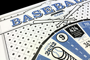
The “Baseball: It’s a Numbers Game” poster was selected as one of the 353 best designs in the U.S. in 2016. As one of only 62 pieces selected from the Far West region, the poster is featured in both the magazine and in the online gallery. From Print magazine: It’s here: the design industry’s most well-respected annual. […]
I recently finished a project for an hour long documentary produced by KBYU TV. Directed by Rob Sibley and hosted by Gerald Lund, the documentary looks at the Mormon Pioneers who literally cut a trail into solid rock to take their wagons through the San Juan River basin in 1879. My role in the project was to […]
Almost since its beginning, baseball has kept statistics on a magnitude unparalleled by any other sport. From batting averages to strikeouts, statistics are available for nearly every player that ever made it to the big leagues. The numbers represent careers, benchmarks of excellence and, in some cases, evidence of futility. With the advent of ever […]
Image of eye © 2016, Jim Godfrey Design, LLC One of the least favorite parts of being a graphic designer or art director is the (hopefully) occasional need to stay up all night to finish a project. Usually this is due to a deadline, but every once in a while I get into a groove […]
After running out of razors, I succumbed to an online ad and clicked onto Harry’s web site. For the unfamiliar, Harry’s sells shavers, razors, cremes, etc. Their brand spoke with a friendly, easy confidence that felt comfortable, inviting and cool. The Brandon Grotesque type greeted me on the site, which felt modern and approachable. It was the same with the […]
If you’re like me, you’ve received a number of Christmas cards in the mail the last few weeks. It’s great to receive greetings from friends across the town, state and country. How did this tradition begin? From one of the most prolific chromolithography firms in the United States in the mid to late 1800s. Louis […]
© 2015 Jim Godfrey Design, LLC I just finished this poster for a production of A Christmas Carol. I started with a sketch, then a photograph of me in silhouette, which I modified so that I looked more like Scrooge. Me in silohouette, looking a little too Scrooge-like, yet needing to look still more Scrooge-like. Although […]
Just in time to coincide with the playoffs, my poster about baseball is almost finished. It’s been 3 or 4 years since I unveiled the Typographic Matchmaking poster. It took some time to decide what to design next and then even longer to find time to design it (it turns out chairing a department at a […]
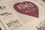
Sometimes I think it is interesting to see the process a designer goes through before arriving at the final design. Here’s the story behind a wedding invitation I designed this summer, which was recently featured on UnderConsideration.com’s For Print Only site. I don’t normally design wedding invitations, but since it was my daughter’s wedding I thought I […]
Some may think that keeping ones typographic soul free from sin can only be accomplished in printed work. But what about the web? Can all sins be avoided? Here are a few tips on how to use HTML and CSS to keep your typographic soul clean, even on the web. This is part 3 of […]
Some may think that keeping ones typographic soul free from sin can only be accomplished in printed work. But what about the web? Can all sins be avoided? Here are a few tips on how to use HTML and CSS to keep your typographic soul clean, even on the web. This is part 2 of […]
Part 1 of 3 Some may think that keeping ones typographic soul free from sin can only be accomplished in printed work. But what about the web? Can all sins be avoided? Here are a few tips on how to use HTML and CSS to keep your typographic soul clean, even on the web. This […]
Image © 2016, Jim Godfrey Design, LLC Lately, I’ve noticed a lot of articles and other resources themed around brainstorming, or activities that will strengthen your creative thinking. As a former art director and creative director, I’ve spent a significant amount of time trying to think of new ideas and concepts for ads and other […]
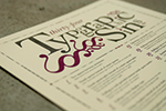
It’s been a number of years since the second edition of my Typographic Sins poster debuted. Featured on For Print Only, notcot.org, How Magazine, dozens of web sites, and pinned extensively on pinterest, I still get people who want to purchase the poster, and I still have copies left. This second edition of 200 was […]