Copyfitting Text in InDesign
Or how to spend a few hours getting rid of widows, hyphens and getting body text to fit in its place.
Once you flow text into a layout, one of the most tedious and unnoticed tasks (unless you do it poorly, of course) is fitting body text into a given space. From brochures to long documents like books, magazines, etc., this is something that requires patience, finesse, and good judgement. Not only is the designer trying to fit the text within the space, but s/he is also trying to eliminate rivers (in justified text), widows and orphans. There are about 9 different ways I’ve found to accomplish these tasks, some more invasive to your design and typography than others. Below is a list of the 9, the least invasive methods are listed first.
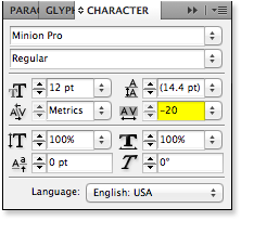
1 – Adjust the letterspacing. This is almost always the first thing I try. Small adjustments are less perceptible to the eye when the type is less than 14 points in size. So I might enter a -5 value in the Tracking field of InDesign (see Figures 1 and 2). If that doesn’t work, I try increments of -5 (-10, -15) until I get to -20. Then I stop. The human eye starts to notice type with letterspacing tighter than -20. By the way, InDesign measures tracking in 1,000ths of an em. So -5 = -5/1000 of an em. What’s an em? It is a relative unit equal to the current point size of the type (1 em of 12 point type = 12 points, 1 em of 8 point type = 8 points, etc.). If there is a line with some big rivers in it (space between the words), sometimes I’ll select the line and change the tracking to 20. This spreads the letterspacing, causing smaller wordspacing.
Figure 1: Adjust the tracking field in InDesign. Negative values decrease the space between letters, positive values increase it.
Figure 2: Entering a value of -20 in the tracking field in InDesign allows the word “only” to move up a line, eliminating the widow.
2 – Add a line break after a word. Sometimes, to get rid of a widow, I’ll look at the lines of type within a paragraph and see if I can add a line break by using a soft return (shift-return) to push one word to the next line. This can create a domino effect that pushes a word on each of the subsequent lines to the next line, giving the last line of the paragraph more than one word (see Figure 3).
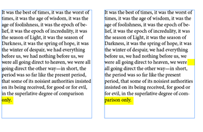
Figure 3: Adding a soft return (holding down Shift when you press the Return key) re-flows the text and pushes part of “comparison” onto the last line, eliminating a widow. Perhaps not the most elegant solution; you could finesse the other lines of text.
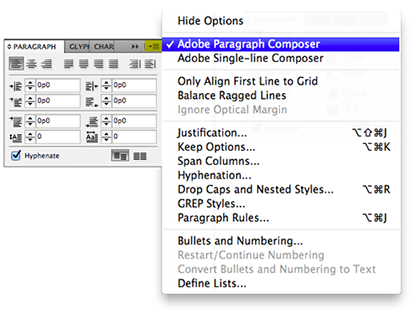
InDesign has what’s called a Paragraph Composer which tries to optimize the length of each line within a paragraph. This works well sometimes, but if you start to add soft returns manually, I would turn this feature off (see Figure 4).
Figure 4: Before you start adding your own hard returns, you may want to go to the Paragraph Panel. In the upper right hand corner click on the icon to see the pop-up menu and, if there is a check beside “Adobe Paragraph Composer,” select “Adobe Single-Line Composer” underneath it instead. This helps you to re-flow the text without having InDesign adjust the other lines in the paragraph for you.
3 – Hyphenate words. To create fewer lines of text in a paragraph (or to pull a widow up to the next line), hyphenating a word can buy you just enough space to eliminate the widow or a line of text.
4 – Edit the text. This can be particularly effective in making text fit into the space you’ve allotted IF you have a good-natured copywriter who doesn’t mind massaging his text. (I say massaging, a copywriter might say “taking a hatchet to my text.”)
5 – Modify the horizontal scale. If you’ve seen the Typographic Sin poster, you know this is a no-no. BUT if you condense the text 3% in either direction, it should go unnoticed. I usually do this to the entire paragraph, as opposed to one line of text or one word. By 3% either way, I mean you could horizontally scale the text 97%, 98%, 99% or 101%, 102%, 103% (see Figure 5).
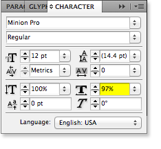
Figure 5: Open the Character Panel and click in the upper right hand corner of the gray bar to see the pop-up menu, then select “Show Options.” The horizontal scale field has been set to 97%.
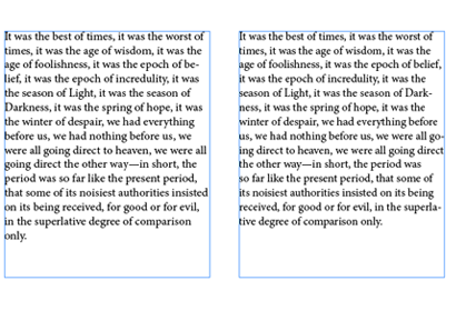
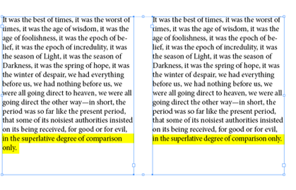
Figure 6: The text on the right has a horizontal scale of 97%, hardly distinguishable from the original text on the left.
6 – Make the column width wider. If you find that the text won’t fit, or that there are a lot of widows or hyphenated words in your paragraphs, you might try extending the width of the columns of text. Of course, you may need to do this for all of the columns, unless you’re widening it less than a sixteenth of an inch.
7 – Make the point size smaller. This can help a lot, but you’ll need to do it with all of the text so one paragraph doesn’t look out of place. And, of course, you’ll want to make sure the text is still readable.
8 – Change the alignment. If you have a lot of rivers in your justified text, you could just align all of the text flush left and ragged right. (Rivers are the large spaces in between words.)
9 – Change the typeface. Try a slightly condensed typeface to fit more words in a space. Or, if you are running short, try a typeface with a slightly wider em width. I once took a brochure that was set in Officina Sans and picked a new typeface for the body text. It took me forever to fit the copy because Officina Sans is a condensed typeface that allows many words per line.
There you have it, 9 things to try. Maybe you have some other secrets you use. If so, post a comment below and share. It could help save us all some time.



Hi Jim,
The thing I cannot work out is the opposite of 2 – Add a line break after a word.
A line has more than enough space for a word but it skips to the next line, eg:
ipsum lorum ipsum lorum
ipsum lorum ipsum lorum
ipsum lorum ipsum
lorum
Backspace puts the word right up againt the word on the previous line but space sends it back to the next line.
Any advice?
Thanks,
Robert.
Robert, sorry it’s taken 6 months to reply. Figure 4 shows the Line Composer and the Paragraph Composer in InDesign. After you highlight your type, try selecting the Line and Paragraph Composer (or deselect them) to see if it fixes the problem. Let me know if it works.