The Sprawling Epic of Designing a Wedding Invitation
Sometimes I think it is interesting to see the process a designer goes through before arriving at the final design. Here’s the story behind a wedding invitation I designed this summer, which was recently featured on UnderConsideration.com’s For Print Only site. I don’t normally design wedding invitations, but since it was my daughter’s wedding I thought I should make an exception.
I spoke with her about a few ideas. I remembered the beautiful initial caps Erhard Ratdolt designed in the 1400s and thought that might look cool, especially if I could create an interesting monogram of the couples’ first initials and then weave some modern looking vines in and out of the letter forms.
Erhard Ratdolt, 1477
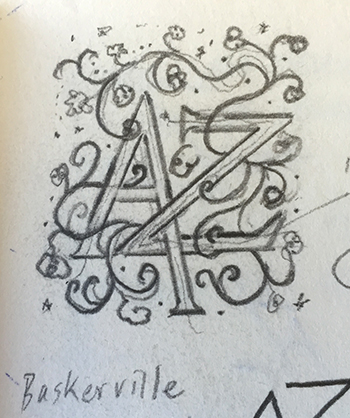
It turns out that my daughter is a great client. After I showed her the sketch below she was very excited about the invitation.
Thumbnail drawing from my sketchbook.
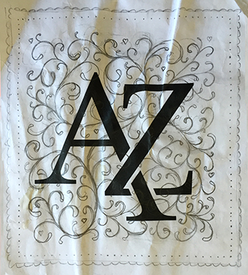
I experimented with various AZ combinations, using a variety of typefaces, before I settled on the one below. Then I printed it and began drawing some vines around the letterforms.
Rough drawing at about actual size of the announcement (a little larger than it ended up, actually).
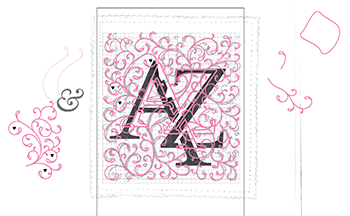
Again, I showed the comp to my client and the couple was quite excited. I scanned the image and placed it in Illustrator and began to draw the vines. After I’d drawn a few, I could resize them, rotate them and reuse them to create the layout. This not only helped save time, but helped provide continuity and unity to the vines.
Screen shot from the file on my computer in Illustrator.
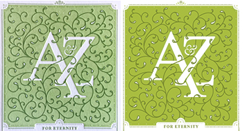
It was a long, laborious process to get everything refined, but I enjoyed it. As I ran out a color comp to show my daughter, a strange color shift occurred. BUT we all liked it better than what I had created (see below).
Color we printed on the left. Original color on the right.
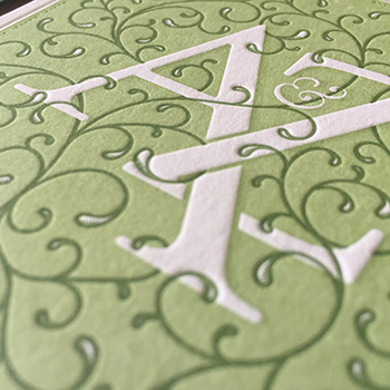
We thought about printing the invitation digitally, as I was very impressed with the level of detail I got from a Xerox 1000 on Crane Letterpress paper (created specifically for use on a digital press). After some thought and discussion, however, my wife and I decided we wanted the tactile feel of the indented surfaces created by letterpress.
The tactile nature of letterpress is hard to resist.
So I asked my friends Leland and Mackenna at Rowley Press to print the announcements and cards. That meant I needed to create color separations for Rowley Press to send out to make polymer plates. That is always an intense process to get all the details right. Below are some screen shots of both plates.
Pantone 576 plate (top) and Pantone 578 plate (bottom)
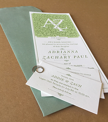
The printing turned out beautifully (thanks Rowley Press!). I found some envelopes online that matched the colors for the announcement and everything came together in a way that made my daughter, her fiancé, her in-laws-to-be and her mom happy. Oh, and I was happy, too.
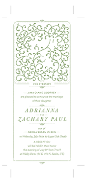
Completed invitation


