Aligning Baselines of Text in Indesign
Typesetting Tip: How to make sure baselines line up in your body text.
When two columns of text sit on a page, aligning the baselines of both columns of text facilitates readability and improves aesthetics. Sometimes, due to the inclusion of subheads in the text, the baselines of the columns do not align (see figure 1). Some page layout software, like InDesign, feature a one-click solution that aligns the baselines by adjusting the space before a subhead and/or the leading of the body text. While this does accomplish the task of aligning the baselines, it can also leave unsightly gaps on the page (see figure 2). By using simple math, I’ll show you a way to align baselines without using the “align to baseline grid” solution in InDesign.

Figure 1: Baselines of text from column to column don’t line up.
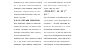
Figure 2: Clicking “Align Baseline Grid” in InDesign destroys your leading.
The underlying principle behind this solution is that if the leading of each line is the same, all of the baselines will align.
First, look at the leading of your body text. Let’s suppose that you are setting Adobe Caslon Pro at 10 points with 14 points of leading. And you’re using Gill Sans at 12 points with 16 points of leading (see figure 3) and 7 points before each subhead. To align the baselines, change the leading on your subhead to 14 points. It doesn’t matter that the point size is different than that of the body text, because InDesign is looking at your leading to determine the space between each line. Sometimes you may want to add a bit more space before and after a subhead to set it apart from the rest of the text. To keep the baselines aligned, make sure that the total space before and after a subhead adds up to the leading. For instance, in the above example where the leading is 14, we could add 12 points of space before the subhead and 2 points after it. 12 + 2 = 14 points. The baselines will all line up (see figure 4).
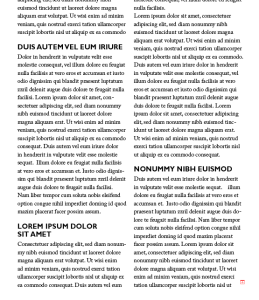
Figure 3: Body text is set at 10/14 (10 pt. type, 14 pt. leading). Subheads are 12/16 with 7 pts before each heading.
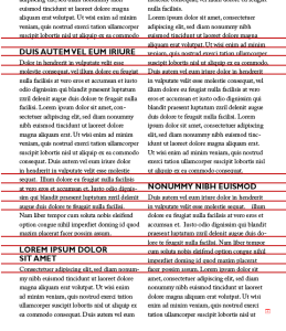
Figure 4: Leading for body text stays the same. For the subheads, it is changed to 12/14 with 12 points before the subhead and 2 points after it (12+2=14).
For longer subheads that span a couple of lines, 14-point leading may not be optimal. But that is a small sacrifice to keep your baselines lined up, especially since most of your subheads may be one line, not 2 or more.
A little math goes a long way.



this is a great explanation of how to make this process work correctly when using subheads.
however, unable to open Figure 3 in to get a larger view … link can not find the Figure 3
thanks,
—Wayne
Thanks Jim. I used this technique to help set up a large tender doc I was working on mostly to great effect. However, how do you get around when the sub head appears at the top of a text frame? This throws the alignment off as Indesign is sets the top of the text frame by the size of the first letter. For example, if you’re using a larger sub head at the top of one column with smaller body beneath, it won’t align to an adjacent column which starts with the smaller body copy. I had to manually fudge each column to make it work in the end, but it would be great to know if you, or anyone, knew of a simpler workaround.
Thanks again.
Andy
If you aren’t locked on a baseline grid, the best way I know of to control the first line at the top of the text box, when you have some subheads and some with body text, is through the Text Frame Options by setting a Fixed Offset. Otherwise, if the headspace of the font varies from box to box, it will throw off the baselines.
Great suggestion, Kelly.