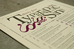
Typographic Sins on the Web (part 2)
Some may think that keeping ones typographic soul free from sin can only be accomplished in printed work. But what about the web? Can all sins be avoided? Here are a few tips on how to use HTML and CSS to keep your typographic soul clean, even on the web. This is part 2 of a 3 part series.
12 – Underlining titles instead of italicizing them.
Thou Shalt Not: The Holy Bible Thou Shalt: The Koran
Underlining on the web is so 1998, even with links. Use the html tags <em></em> to italicize. How do you get rid of the underline on your links? In CSS, add the attribute “text-decoration” to your anchor tag style sheet(s) and give it a value of “none” like this:
a {
text-decoration: none;
}
13 – Failing to eliminate widows.
A widow is a word that sits on a line by itself at the end of a paragraph.
Avoid this or risk being cast into a lake of fire and brimstone.
Because everyone can make their browser window as wide or as thin as they want, this is not something you can resolve. Just relax and don’t worry about it.
14 – Failing to eliminate orphans.
An orphan is the last line of a paragraph that sits alone at the top of a
column or page. Type does not like to be alone.
Not usually a problem, as flowing text between containers on the web is not common. Again, chill.
15 – Rivers in justified text.
Unsightly large spaces between words occur if the line length is too short or the point size of the text too large.
To resolve this on the web, either increase the width of your containers (so they have a longer line-length) or align your text to the left instead (see below).
16 – Inconsistent leading.
Paragraphs should have the same leading for each line.
This is usually not a problem on the web, as line spacing is applied to block elements like paragraph tags and heading tags. One thing I don’t like, however, is the default spacing on heading tags (h1, h2, etc.) and the paragraph tag <p> on the web. There is usually way too much space after the heading:
What typeface is the most readable?
The most readable typeface in the world is Century Schoolbook, designed by Morris Fuller Benton. Or is it really Garamond? Helvetica?
To adjust this, modify the “margin” and “padding” attributes for your heading and paragraph styles:
h1 {
margin-top: 0;
margin-bottom: 0;
padding-top: 0;
padding-bottom: 0;
}
p {
margin-top: 0;
margin-bottom: 0;
padding-top: 0;
padding-bottom: 0;
}
This creates no margin or padding before or after your h1 and p tags:
What typeface is the most readable?
The most readable typeface in the world is Century Schoolbook, designed by Morris Fuller Benton. Or is it really Garamond? Helvetica?
If you want to add some space before and after, start experimenting with the padding:
h1 {
margin-top: 0;
margin-bottom: 0;
padding-top: .5em;
padding-bottom: .5em;
}
What typeface is the most readable?
The most readable typeface in the world is Century Schoolbook, designed by Morris Fuller Benton. Or is it really Garamond? Helvetica?
It is usually a good idea to use the “em” as the unit of measurement instead of using pixels. Ems are relative units that are based on the height of the letterform. If you specify ems (em) instead of pixels (px) and the type is scaled larger or smaller, the spacing will increase or decrease with the size, keeping the proportions the same.
17 – Indenting the first paragraph.
The first paragraph is never indented, subsequent paragraphs are.
To indent paragraphs, use the following attribute and value (1 em is a standard paragraph indent):
p {
text-indent: 1em;
}
18 – Indenting a paragraph too far.
The standard indent for a paragraph is 1 em, not ½ inch.
(See above.)
19 – Failing to hang punctuation into the margin.
Punctuation has less visual weight than letters or numbers.
Compensate for this in display text by hanging the punctuation into the margin.
While not impossible to do on the web, this one is harder. Take a look at the text I created below.
“Lorem ipsum dolor sit amet
adisciping milorum quantum”
I used the following code:
<h3 style="text-indent: -.5em; margin-left: 1em;">
20 – Failing to use or create fractions.
Wicked: 1/2
Righteous: ½
How can you create fractions on the web? For ¼, ½ and ¾ it is easy, just use these html character codes:
¼ = ¼
½ = ½
¾ = ¾
For custom fractions, it is a little more complicated. You need the <sup> and <sub> tags and the html code for a slash: ⁄
7⁄8 = <sup>7</sup>⁄<sub>8</sub>
If your fraction looks a little goofy, add the following attributes to your css:
sup { vertical-align: super; font-size: smaller; } and sub { vertical-align: sug; font-size: smaller; }
For more information, try logging on to changelog.ca, which has a great tutorial.
21 – Incorrectly abbreviating am and pm.
Unclean: am, AM, A.M.
Relatively Clean: a.m.
Clean: a.m. or am
AM and PM should be set in small caps. To do that on the web, use the css attribute “font-variant” with the value “small-caps” (see below). However, see the entry about faux small caps (#23) posted below. It may be better to use the other options for Relatively Clean or Clean shown above.
p {
font-variant:small-caps;
}
22 – Failing to provide margins for type in a box.
ugly
beautiful
Here is the code for “beautiful”:
<span style="border: 1px solid #000; padding: 1em;">beautiful</span>
23 – Faux italic/oblique, bold and small cap type.
Impure: Italic (faux italic on poster) | Pure: Italic
Sinful: Bold (faux bold on poster) | Virtuous: Bold
Unkosher: SMALLCAPS (faux smallcaps on poster) | Kosher: Smallcaps (smallcaps text on poster)
On the web, if you use the <em> tag, it will use the italic version of the typeface. In CSS, you can also use the “font-style” attribute with one of three values: normal, italic, oblique. The downside is that if you choose oblique and there is not an oblique version of that typeface, it will just slant the letterforms. Boo! Hiss! The same goes for specifying small caps: since most web fonts don’t have small caps, it changes the size of the caps to match the lower case, resulting in slightly different weights for the letterforms. For bold you can use <strong> or the attribute “font-weight” and then specify a weight. If the typeface does not have that weight, the typeface will not change.
Go to Typographic Sins on the web (1 of 3)
Go to Typographic Sins on the web (3 of 3)
[…] G o to Typographic Sins on the Web (part 2 of 3) Go to Typographic Sins on the Web (part 3 of 3) […]
[…] Go to Typographic Sins on the web (1 of 3) Go to Typographic Sins on the web (2 of 3) […]